Some Background
iOS and iPadOS apps both support a launch screen that will be shown first when the app launches. The purpose of the launch screen is to indicate the app has launched but it may still be doing some background tasks or unwrapping the UI before it’s ready for the user. It’s traditional to show a splash screen or an image of your actual UI for the launch screen. This makes the app feel responsive and the device feel fast. This has always been a bit of an Apple sponsored hack to make things feel smooth and quick for users. It works.
The old way of creating a launch screen is by defining a view in a storyboard and pointing Xcode to that view. That view might be just a UIImage or it could be any view you like. This worked fine in the days of UIKit where you may have already created the UI views in a storyboard so you could easily replicate your UI view as a launch screen in order to make it appear the app was loading quickly.
In the days of SwiftUI where many things remain in flux, there are new ways to create launch screens. You can still use the older method but it’s more difficult to create a view that matches the view you dynamically generate in your SwiftUI code.
In my current app my initial view is displaying a circular image close to the center of the screen and that image is magically sized in my SwiftUI code to best fit the screen. There are several other text elements displayed and I don’t do much more to place them then drop them all in a VStack and using some spacers. Replicating that magic in a UIView from a storyboard is difficult and some things may in fact not be possible. In order to come up with something that didn’t create a jarring transition from launch to live UI I needed a solution.
The newer method of creating launch screens is to specify some values in your info.plist file and let the compiler build a launch screen for you. Unfortunately you can only pick a background color and image to be shown along with options to display navigation items such as a navigation bar or a tab bar. This method may work if you just want a splash screen shown before the real UI but for other usage it’s not great.
My app starts by displaying a full view loading screen so using a splash screen that transitions to what amounts to another splash screen before the actual UI seemed like a bad idea.
I started by trying to mimic the loading view in UIKit to appear that the loading view was displayed immediately upon launch but I quickly tired of setting constraints and trying for pixel perfection between UIKit and SwiftUI. I spent some time thinking it over and thought what if I didn’t use a launch screen at all? Up until this point in the development cycle this was how the app was working and it wasn’t awful but it also lacked a bit of the polish you like to see in a finished product.
When my app launches the first thing it needs to do is query an API for data updates. I initially display a loading view to indicate to the user that something is happening before we can present any data. In my current app this loading screen is a full screen view and that works well with this solution I’m presenting here.
I decided to make it appear as if the loading view was the launch screen and that loading view would fade in as the app launched. The launch screen is just a blank view with the background color set to match the color of my apps initial screen. Then my loading view is displayed with a fade in animation that presents a nice transition from the blank launch canvas to the actual UI. It’s fast enough in practice that it’s not noticeable what’s happening. The user just sees the UI fade in and the app is ready.
Sample App
I put together a sample app that shows this in more detail and here is some explanation of the steps taken.
In the sample app, which is similar to my current project, there is a view model that fetches some data and reports its state. The state of the view model can be one of loading, ready or error depending on the result of the data fetch.
There is a main view that switches its display based on the state of the view model. So on initial launch, while the view model state is loading" a LoadingView is shown, as shown below:
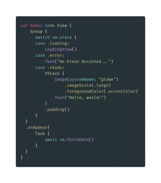
The loading view presented can be any SwiftUI view. The idea with this sample app is that the background color matches between the loading view and the launch screen setting. This requires creating a new color asset in Xcode for the color to be shared. This is necessary because in order to specify the Launch Screen Background Color in the Info.plist it must be a named asset. So in the Assets of the Xcode project select Editor -> Add New Asset -> Color Set (or select a Color Set from the + button in the lower left of the Asset panel.
Name the color as desired and configure it to your needs. In the sample project the color is named “blueAssetColor” and it’s just the standard predefined “systemBlue” You can not use the predefined color names in the info.plist.
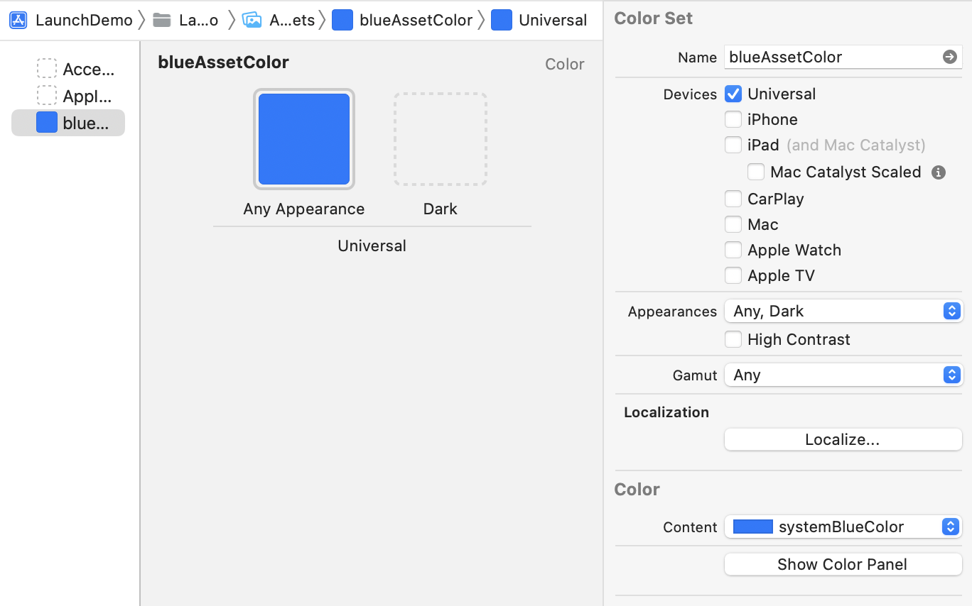
Next you need to tell Xcode to use this color as the background for your launch screen. Navigate to the info.plist by selecting the project in the Project Navigation, selecting the target for the app and the info pane in the editor. Find the item for Launch Screen and add an item within that group for Background Color entering the asset color you created earlier. In our sample project this value is “blueAssetColor” There may be an item under Launch Screen when you first expand the item in the info editor labeled “UILaunchScreen” you can delete this entry.
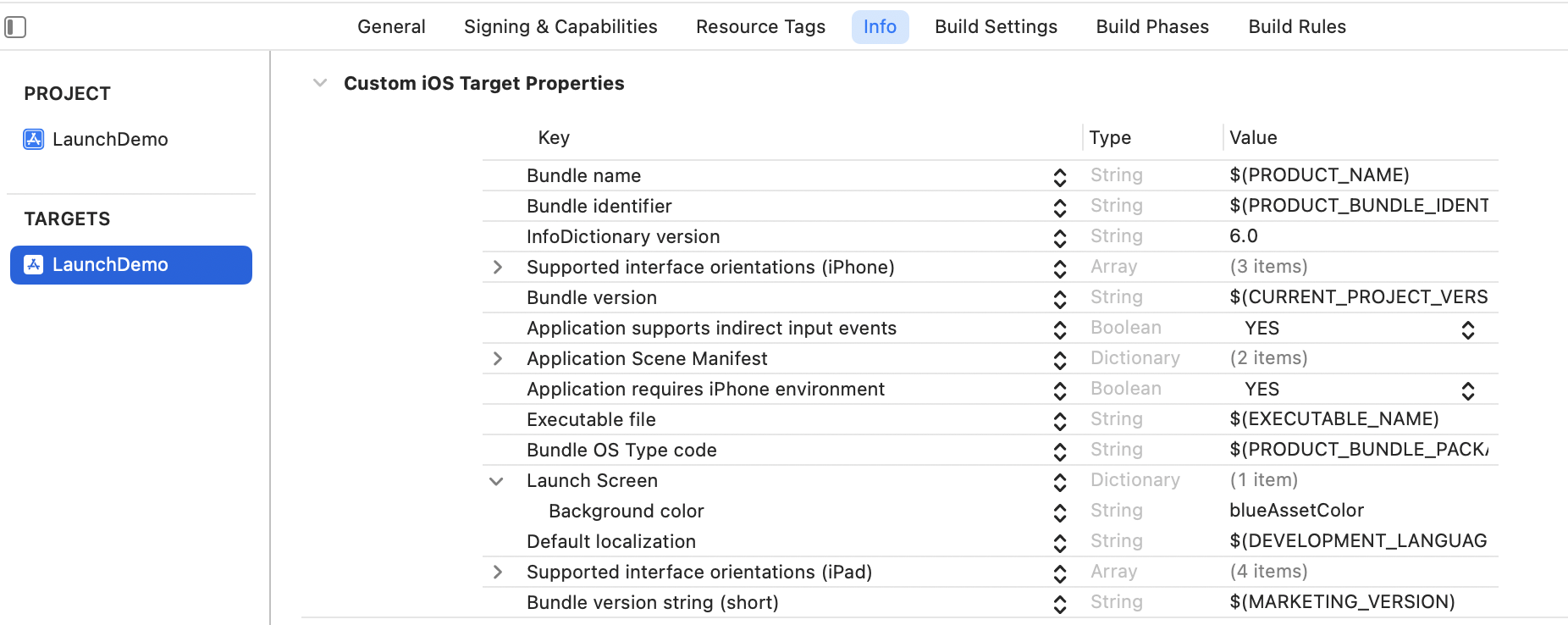
With these steps completed the your app should launch with a blank launch screen and the background color will be the one you have specified here.
The loading view can be virtually any SwiftUI view as long as the background color matches the launch screen color. The trick is to have your UI elements fade in over time. The code below shows how to use an animation to fade in the UI over two seconds. The first animation in the code is just to rotate an image on the loading view to indicate the app is working. The fade in animation is setup on the onAppear block later in the code.
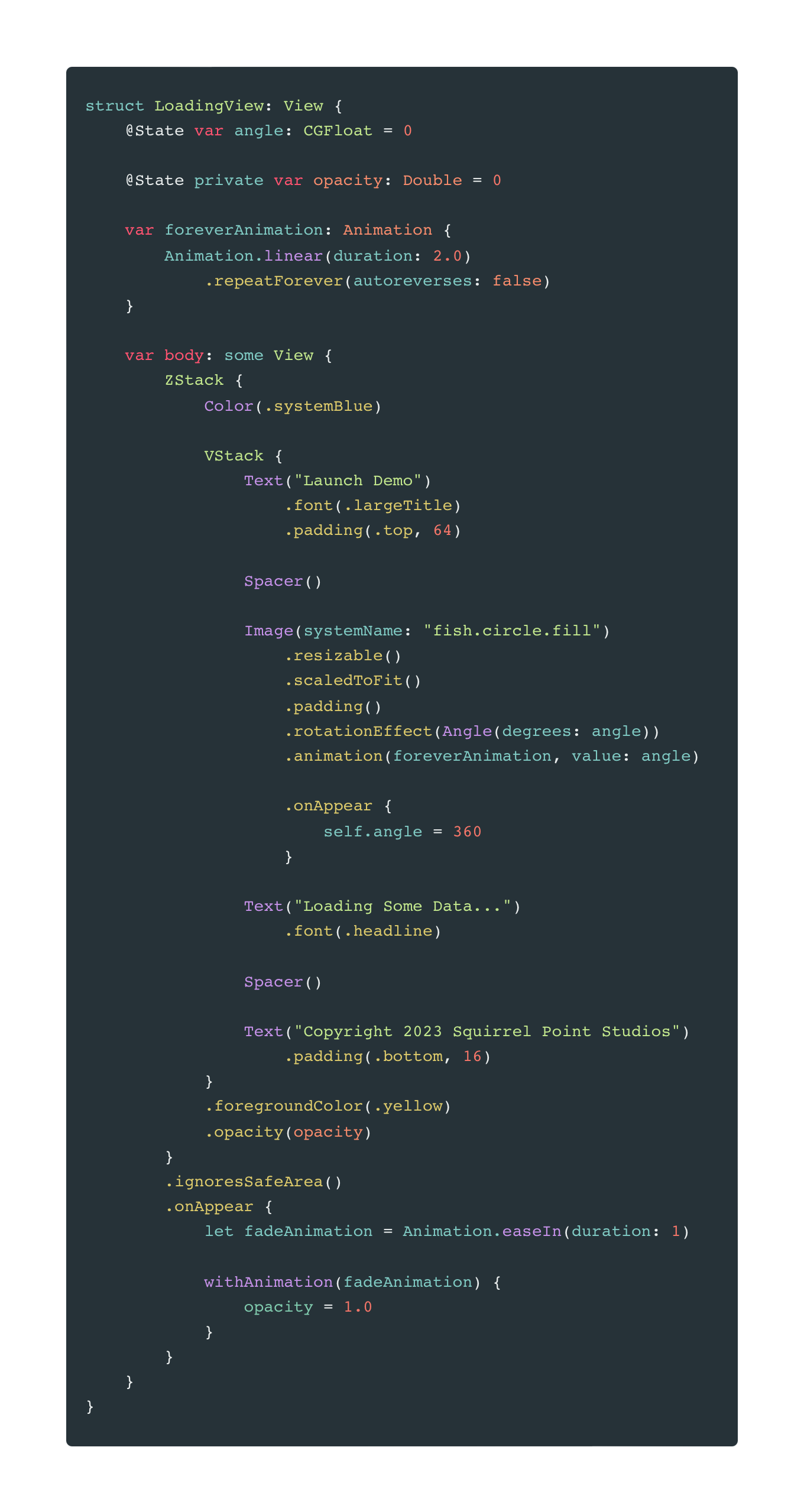
The end result is a loading screen that look like the following:
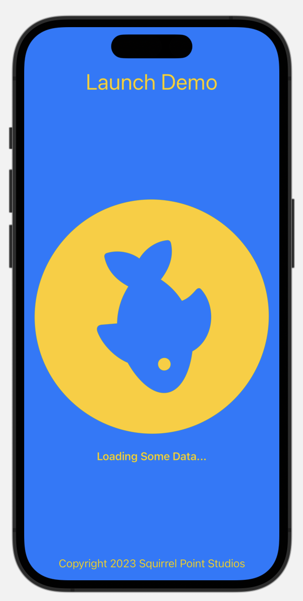
All the elements in yellow will fade in over the blue background. The fish image will also rotate as it is faded into view. The loading view is just standard SwiftUI and could be any view you like. Once the view model reports it’s ready, the app will transition to the main UI view and the user can get to work.
The full source for a sample project is available via GitLab This approach may or may not apply to your projects but it does show a different way to think about Launch Screens. If you have any comments or suggestions I can be found on Mastodon or via email